
Contents
How many layouts have you seen today? More than likely, you’ve seen only two or three. You’ve probably seen a number of grids and a number of bilateral (centered on an axis) designs.
I’d bet anything that you haven’t seen any designs using an axial layout system, or a transitional system.
It’s sad, but there really isn’t that much visual diversity in our lives. You see the same few poster designs, the same few website layouts, the same stuff over and over. It gets boring.
When you do see something new, it stands out. It’s cuts straight through.
Being able to cut through—to create diversity in your designs—is one of the best skills you can learn. When I talk about standing out, I don’t mean dropping a sexy woman on your design or using neon colors—I’m saying you can make your work stand out by breaking the mold.

Contents
Axial
I want to dive into Axial designs—to use the axial system (sounds like some made-up scientific term, doesn’t it?): Just put everything on either side of a line.
Trees have axial design. They’re made of different branches coming off a central stem; flowers are like this too. Axial designs can be either symmetrical or asymmetrical around their axis. We’ll talk more about this in a bit. Axial and bilateral (centered) layouts are different. I want to explain this difference before we get too deep:
How to create an Axial design
To create an axial design, divide everything by an imaginary line (an axis). To create a bilateral design, put the center of everything on the same line. The difference might sound semantic, but it’s really not. In the former, lines of text each stay on one side, in the latter, the text runs across. If this distinction doesn’t make a bunch of sense now, just read keep reading, then compare this to bilateral design.
Now, draw a light line on the page—it can be straight, curved, or zigzag. It can go down the middle or to one side; it can even cut off a corner.
Next, put your content along either side of this line in a way that makes the important stuff look important. In other words, draw attention to the big pieces of information first.
By the way, I always design by hand first. It’s quicker and doesn’t lock you into the more formal things like color and font. Designing by hand—with a simple pencil and paper—lets you test a bunch of ideas quickly. It also means that you don’t lose your ideas—they’re all in your notebook.
Your designs will mature over time, too. At first, they’re probably look a bit basic and chunky. You’ll explore asymmetry and new ways to direct the viewer’s eyes.

Symmetry
The text and graphics on either side can be either symmetrical or asymmetrical. Put simply: you can either make a straight line and match everything on either side, or you can do whatever you want.
It’s easy to see why asymmetrical designs can look better—they’re more dynamic and treat the page well.

Adjust the column width
No one says your columns need to be a certain size—or even that they need to be the same size on either side of the axis. Thin columns keep the content digestible; you can make each column one word, phrase, or sentence. Wider columns give you more room to play, since you can include entire sentences or paragraphs comfortably. It’s about creating texture with your text. How is the page meant to feel? Is it meant to be dark or light?

Angle your axis
Who says you text needs to be straight up and down? Turn it around, flip it backwards—try something new until you find what’s right. Again, most of this exploration can be done on paper; that way you’re not just throwing stuff at the wall to see what sticks.

Add “non-objective” elements
You can add circles, squares, triangles, or rules to make your design more visually appealing. You can also use these to draw attention to different pieces of text or balance the page.

Implicit vs Explicit axis
Most of the time, you won’t actually have a big fat line running across your page, instead, you’ll just imply your axis with text.
Sometimes, though, you’ll want to line up the text to something visible—a photo, a background graphic, or something else.

Mess with the text
If you’d like—and I won’t blame you—get a little weird with your text. If something isn’t super important, or if you want to slow your viewers down a bit so they pay attention, try stretching a word or phrase, remove punctuation, etc.

Contents
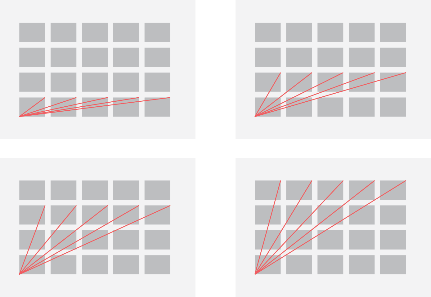
Radial
When you read radial, you probably think of the sun, and that’s no mistake. To create a radial design, pick a central focal point, and place all the content so that it radiates out from that point.
Tires, jellyfish, and domes all use radial layouts. Text might get harder to read when set in a radial layout, so you wouldn’t want to use it for a book or anything, but it’s very useful for posters or interactive websites. It’s one of the more visually interesting layout systems we’ll go over.
How to create a radial design
Start with your content and medium, as always. You want to know exactly what graphics and text you’re going to use, and you want to know how large the overall composition is meant to be.
Once you know all this and have figure out the hierarchy of text (what’s the most important, second most important, etc.) you need to pick a focal point (or a few) in your composition, and start setting the type around it.
Again, I highly recommend starting out with paper and pencil because radial designs can get cumbersome.

Adjust the inner edge

Adjust the outer edge
The world is your oyster. I love radial designs because of the flexibility they offer. Rather than aligning your text based on its inner edge, look at the shape created by the outer edge of the text. Fit it into a circle or square or triangle. Don’t get too complex, though, as these shapes can become difficult to recognize.

Grouping
Again, the traditional principle of leading does not apply to radial designs, so shift your pieces of text around to create different groups. This is one of the easiest and best ways to create hierarchy with your radial designs; especially because once you have things in groups, it’s easy to add styles to the different groups individually.

Enclosure
The world is your oyster. I love radial designs because of the flexibility they offer. Rather than aligning your text based on its inner edge, look at the shape created by the outer edge of the text. Fit it into a circle or square or triangle. Don’t get too complex, though, as these shapes can become difficult to recognize.

Use non-objective elements
Often, the focal point is implied by the text, but you can pronounce it with a graphic. You can also use simple shapes and rules to draw attention to the text or balance the page.

Contents
Dilatational
Di-la-ta-tion-al (it’s a mouthful) designs use type set along circular paths. Basically, rather than radiating out from a point, as in radial designs, the text forms curves around a point.
The rings of a tree trunk are a great example of dilatational design. This is another example, though, where text can get tricky to read; if, for example, the words create a full circle, the text at the bottom will be upside down. This makes dilatational designs suited for small blocks of text and posters.
How to create a Dilatational design
Get your text, graphics, and hierarchy chosen. Then, on your composition, create a circle (or several), and begin typing along the edges of the circle. You can do this in Adobe programs using “type on a path.”
Sketch out your design on paper first so you know how everything will fit together.

Vary the circles’ centers
Sometimes you’ll want to use concentric circles to keep the type spaced well. Other times, though, you can use slightly varied centers; this creates a more organic—albeit a less organized—appearance.

Use multiple circles
An extension of using varied centers, if you place the circles completely outside one another, you can create many varied designs. This can be extra useful when you want your type to break into discrete groups or when you want to create a sense of movement through the composition.

Vary the size of the circles
Again, the traditional principle of leading does not apply to radial designs, so shift your pieces of text around to create different groups. This is one of the easiest and best ways to create hierarchy with your radial designs; especially because once you have things in groups, it’s easy to add styles to the different groups individually.

Use non-objective elements
The world is your oyster. I love radial designs because of the flexibility they offer. Rather than aligning your text based on its inner edge, look at the shape created by the outer edge of the text. Fit it into a circle or square or triangle. Don’t get too complex, though, as these shapes can become difficult to recognize.

Add tangential circles
Basically, you can have text start wrapping on one circle, then swap to another. This helps create a sense of motion in your designs.

Contents
Grid
Some of the world’s best designs and designers used grid layouts almost exclusively. Massimo Vignelli and Josef Muller-Brockmann advocated its use above all other systems. Learning to create a good grid layout takes some math, some preparation, and heavy dose of discipline. With a grid, all the text and graphics fit neatly into columns and rows.
Using a grid puts the text first, so there’s rarely any doubt about readability. This system works well on posters, books, essays, websites, cards, resumes—pretty much anything.

How to make a grid
Grid compositions always start with the text and the composition size. Sketch a rectangle that’s 1:1 with your composition size. For example, if you’re working on an A4 paper, then sketch out an A8 size rectangle.
Then within that rectangle, choose the boundaries for your composition. You want dynamic margins that fit the viewer’s needs. If you’re designing a magazine spread, for example, you do not want the bottom margin too small or the side margins exactly the same. Life is asymmetrical.

Next, decide the number of columns for your grid. The column width and text size determine the measure, and remember, you don’t want the measure to run too wide. Make sure to factor this in when deciding the number of columns you want. If you’re working in print, pick a good text size for print (we’ll use 10pt in our examples). If you’re working on the web, then use a good text size for screens: something close to 15pt should do it.

From this point on, you want to work with the full, final document size. Fill a column with your text at your text size and count the number of lines that fit. Adjust the boundaries of the composition so that the top border lines up with the ascenders on the top line and that the bottom border lines up with the descenders on the last line.

Then divide your composition into rows. These should be based on whole numbers of lines with a line of white space between each of the rows. For example, if your composition fits 55 lines of text, you could have:
- 14 rows with 3 lines of text each (and a line between each row)
- 8 rows with 6 lines of text each (and a line between each row)
- 7 rows with 7 lines of text each (and a line between each row)
- 4 rows with 13 lines of text each (and a line between each row)
Now that you have your grid, here’s how to use it.
You can combine the grid fields to create various “visual fields”, which you can combine to make up your composition.
For example, a grid with 4 columns and 5 rows can accommodate 20 different sizes of visual fields, from 1×1 up to 4×5.

Fill these with your text and graphics such that nothing spills over into the spaces between the visual fields.

Free eBook Download
You can download this entire post for free!

Contents
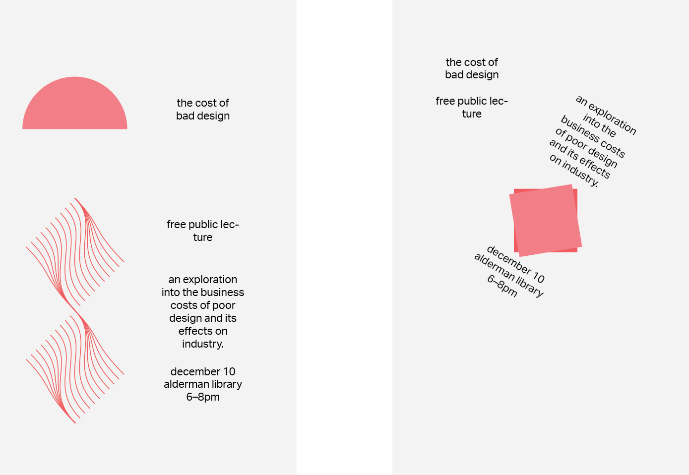
Transitional
Transitional designs are some of the weirdest ones. Basically, they look like the cross section earth–with layers of sediment and stone. That’s really all I can say about them–you just have to see them to know what I mean.
I can’t recommend transitional designs for most projects; they just appear too disorganized for a resume or even a flyer. For posters and book covers, though, they can definitely work.
How to make a transitional design
Start by hand, laying out the kind of structure that you want. Draw thin “sediment” lines in whatever form you want–I recommend looking up actual sediment layer images and working from there. The key is to get your composition to look as natural as possible.

Movement
Try implying some amount of movement or slippage in your composition. As if the text is sliding into place. You can show this with angles, shapes, and text placement.

Direction
Your text can all line up or it can fall on each other. It can be straight or it can be diagonal. It all depends on the content and how you want to design it.

Use non-objective elements
Try including some simple shapes and rules into your designs to accentuate the layers in your design. As with the other systems, non-objective elements can add visual intrigue, emphasis, or balance.

Contents
Bilateral
Bilateral designs are all over the place, but you may know them by another name… centered. And I’m going to come right out and say it: I think 99% of bilateral designs are boring as hell. They’re so… lazy and regular.
Many things in nature have bilateral designs. Sort of… In all reality, nothing is symmetrical or centered, which is why bilateral designs are lost on me. People aren’t symmetrical. The Earth isn’t symmetrical. On an anatomical level, nothing is symmetrical. So why try to make your design symmetrical?
This idea becomes far more obviously absurd when you realize that words aren’t symmetrical, so no design can ever be symmetrical.
Anyway, you still deserve to know how to create a bilateral design, and I’ll do my best to show you how to create a good one, at that.
How to create a bilateral design
Put all your text on the page. Center the text. Now comes the tricky parts.
What you’ll find with bilateral designs is that the texture of your work and the asymmetry of its elements become very obvious. A page full of centered text looks ugly, so how do you center things and still make it look good?

Use your vertical space
Try shifting some or all of the text up or down, creating vertical asymmetry. This can help alleviate the dullness of the centered text. If done well, this can actually act as a subtle nod to the text’s symmetry.

Use your horizontal space
Try including some simple shapes and rules into your designs to accentuate the layers in your design. As with the other systems, non-objective elements can add visual intrigue, emphasis, or balance.

Use Multiple Groups
You can break your content into two or more groups, each with its own axis. This can be a good way to split up the monotony of centering everything.

Tilt
Skew the line on which all your text is centered. No one said the words need to go straight up and straight down, so play around with different options here.
Use non-objective elements
As with the other systems, non-objective elements can add visual intrigue, emphasis, or balance. Throw in a circle, rectangle, triangle, or rule every now and again.

Contents
Modular
Usually people associate modular layouts with the grid; while they go together very well, no one is forcing you to use a grid here. Modular layouts use repeating structures to break up the content.
These structures can be basically anything: shapes are the most common.
I suggest using modular designs for pieces of content that are already cut up. For example, a poster that lists multiple concerts in a series is perfect.
How to create a modular design
Come up with a repeatable structure that fits your content. For example, you could put everything into squares (which might end up looking like a grid) or circles (which could end up looking like bubbles or clouds). You could put everything into a grid with the same treatment over and over again.

Squares
Try placing your content into squares. It might look like a grid, and that’s okay. You can make the squares any size you want and arrange them in any way you want. Seriously, try things out.

Circles
Use circles for your modules. You can type inside the circles, or use a series of radial designs or dilatational designs.

Use other things
You can make your modules out of pretty much anything. Any shape, any layout, anything. They’re really mini compositions that come together to make a larger composition.
Free eBook Download
You can download this entire post for free!


Comments
Great breakdown of different type layouts!
Thanks Julia!
Amazing article!
Really valuable info to help create variations and typographic interest. As a young designer I found this helpful in exploring new ‘types’ 😉
Hey Darren,
Thanks for the comment! Any ways that I can make it better for you? Or any ideas for future guides?
I teach typography so this article it’s a very simple y quicly way to figured how apply system in design. Excellent!!!
Feel free to use it for your classes! 🙂
wow nice list of ideas
Wow! Very informative and in depth!
Thanks Joe! I’m glad you liked it. Download the PDF so you’ll always have it 😉
Fantastic! Thank you! 😊
Really valuable for students like me, thank you!
Thank you, Lucas!
Pingback: Vision Board – Holly Silvia's Mastery Journal
Pingback: MDM565 Reflection – Holly Silvia's Mastery Journal
Pingback: Dynamic Vision Board – Holly Silvia's Mastery Journal
Pingback: Motion in Context – Holly Silvia's Mastery Journal
Interesting and very illustrative. Congratulations!!
I am really grateful for this content after I spent 30 mins aimlessly surfing the internet looking for accurate and understandable information
This looks like the same set as outlined in Kimberly Elam’s book, Typographic Systems, except the “random” system is missing – why is this? Would also love to your citations/references/bibliography!
Hi Rachel!
I should have done a set of references.. I suppose it’s never too late to add one though.
I wrote this after reading Typographic Systems and Grid Systems in Graphic Design. I left out “random” because at the time (and to a lesser extent today), I do not recommend it. Maybe it’s personal preference.
Thanks!